Showing posts with label Design. Show all posts

25.8.09

Personas


A very interesting web app from MIT called Personas has captured my intrigue today. Using public data, it creates a graphical representation of who "you" are (obviously if you have a common name, the information it provides could still be an interesting representation of something else). Click the image to see mine.
Check it out here: Personas.

27.2.09

Skyscrapers that won't be built, math in design, and another interesting find that will surely get some response


So, I'll be the first to admit it: I love tall buildings. No matter how excessive or what the environmental and cultural impact, or even how hypocritical this makes me seem, I think they are absolutely fantastic creations and I just love them. So, while the world's in the middle of this financiapocalypse, it sorta (only sorta) saddens me that some are being delayed. Tyler has a sad face.
Here are the top 15 skyscrapers that will take much longer than originally anticipated to finish. I will say that I am so happy that Freedom Tower is not on this list.
Also, for any aspiring graphic/logo designers and/or Mathematica gurus, you should check out "Exploring Logo Designs with Mathematica." It's a brilliant read that combines science, programming and art. I love it.

Now for the part that I expect will trigger some interesting reactions. Harvard Business School has just released a study on online pornography consumption in the USA. While the bulk of the study showed that there isn't a HUGE gap between states and online porn orders, there were a few interesting tidbits I'd like to bring into the limelight:
Those states that do consume the most porn tend to be more conservative and religious than states with lower levels of consumption, the study finds.
...

There has to be a better explanation out there besides the age-old "if you're told you can't have it, you want it more" argument.

The biggest consumer, Utah, averaged 5.47 adult content subscriptions per 1000 home broadband users; Montana bought the least with 1.92 per 1000. "The differences here are not so stark," Edelman says.
...
Eight of the top 10 pornography consuming states gave their electoral votes to John McCain in last year's presidential election – Florida and Hawaii were the exceptions. While six out of the lowest 10 favoured Barack Obama.

Utah's been a leader in a lot of things as of late, but you'd hope this wasn't one of them. I find it INCREDIBLY interesting: 8 of the top 10 porn consuming states voted for a conservative president. I claim to be no authority on the subject, but I find it interesting that this stat correlates with the high-religious stat up above. Could it (or should it) possibly mean that religion is a procurer of porn consumption? If so, is it among active participants of that religion, or is it from those who do not participate? Are there more dramatic social/cultural tensions in these highly religious states that cause this increase in porn consumption?

Church-goers bought less online porn on Sundays – a 1% increase in a postal code's religious attendance was associated with a 0.1% drop in subscriptions that day. However, expenditures on other days of the week brought them in line with the rest of the country, Edelman finds.
...
States where a majority of residents agreed with the statement "I have old-fashioned values about family and marriage," bought 3.6 more subscriptions per thousand people than states where a majority disagreed. A similar difference emerged for the statement "AIDS might be God's punishment for immoral sexual behaviour."

Sad, but ironic and kinda funny.

Residents of 27 states that passed laws banning gay marriages boasted 11% more porn subscribers than states that don't explicitly restrict gay marriage.

This, to me, is perplexing. A friend of mine jested that perhaps the homosexual community relies on porn since they can't marry. Humorous, maybe, but I don't think that's the case. I almost wonder if this is a sign that those states who are more accepting to the idea of gay marriage have a higher degree of sexual maturity.

Of course, all this discussion is based on a belief that pornography detracts from the sanctity of sex and that it should be avoided in a progressive society--an idea which I am more than aware could be debated in the secular world.
Anyway, any thoughts?

26.1.09

Fun with Illustrator

Many people ask me the difference between Photoshop and Illustrator. The answer, super-simplified is this: Photoshop is for editing photos, and Illustrator is for creating art. Now, of course, Illustrator can handle photo-realistic images (to an extent) and Photoshop can definitely create art, but when it comes down to it, I would never try to create a web site mock-up in Photoshop anymore, nor would I ever try to map an image to a 3d plane in Illustrator (well, I might...but that's for another day).
I believe that there are two things that you can do to become an expert with these two programs: practice (obviously) and watch others use them (not so obvious, apparently).
I try to find some really good practices for those wanting to practice, and sometimes, I'm fortunate to find video tutorials (like the crazy posters found here, video double below). Here's a good one for Illustrator. And of course, like all of my vids I post, it's quite interesting for the un-artist too.

"Spacegirl"

"Science Machine"

13.1.09

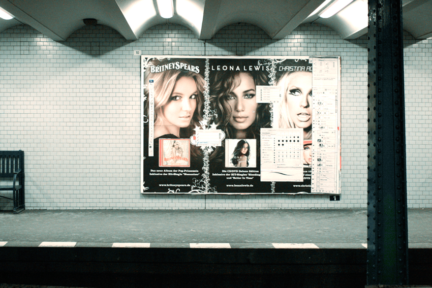
Photoshop'd!

I absolutely love this Flickr set, can anybody guess why?

Quote:
Remember, it's airbrushed
"Don't forget..." is a street art project that consists of Photoshop palettes pasted over heavily airbrushed advertising in a metro station in Berlin. (thx, phil)

[kottke.org]

10.12.08

I (wish i had) Met the Walrus

So, last Sundance Film Festival, an animated short premiered called, "I Met The Walrus." I really wanted to see it, but for those unfamiliar with the way Sundance works, shorts are grouped together in groups of 8 to 10 shorts and screened in a normal viewing time slot. I wasn't able to make one, and to be honest, it kind of faded from memory until I finally saw the short. It went on to be Academy Award-nominated, and it's definitely worth a watch (embedded here in youtube high quality for your viewing please). Don't you love shorts???

Here's Sundance's summary:
"In 1969, a 14-year-old Beatle fanatic named Jerry Levitan, armed with a reel-to-reel tape deck, snuck into John Lennon's hotel room in Toronto and convinced John to do an interview about peace. Using the original interview as the soundtrack, this narrative tenderly romances Lennon's every word in a cascading flood of multi-pronged animation."

6.12.08

Invisible Art and Zoetropes

So, at least one zoetrope is garnering a lot of attention recently, but Adobe's research project is pretty tight too.
Anyway, I ran across this form of art today: the art of becoming invisible. Check it out, it's quite cool.

And don't forget to tune in to President-Elect Obama's weekly message: he brings up the fact that America is ranked 15th in Broadband adoption, and that it needs to change! Woot! (Although he does state that America invented the internet...I'm sure CERN folks have something to say about that...)

30.11.08

Space-age Designs


So, some of you may know that I'm a complete sucker for 60s sci-fi art. Yeah, the actual science-fiction is cool, but the artwork is even cooler. Maybe that's why I didn't have a *completely* scathing review for Indiana Jones 4. Maybe that's why I can enjoy, appreciate, AND recommend Sky Captain and the World of Tomorrow (it's great!!). Well, BoingBoing decided to please me by finding a post on wellmedicated.com containg 45 Vintage 'Space Age' Illustrations. This stuff is FANTASTIC!
And speaking of space, if you're into home-brew astronomy, check this out.
[wellmedicated via BoingBoing]

22.11.08

Photoshop tip during the U game...you had better like it

Well, we're up 27-17 against BYU right now, but I saw this during half-time, and I really felt like I should post it. This Photoshop tip is about lighting: the difference between something that looks good, and something that looks so incredibly awful you want to throw up. Don't believe me? Look at a certain picture hanging in my Grandma's living room. Grrrr...
Anyway, here's the tip, and happy lighting!

20.11.08

Typography of the week

If I had a Typography of the Week award, it would definitely go to James Bond: Quantum of Solace. The handcrafted (by Tomato) typography in the film was just amazing, and for those that want to see them again, or just haven't seen them, here they are:


[images courtesy Tomato and goldenfiddle]

12.11.08

Sea Orchestra--pretty neat animation

This is quite beautiful:

But of course, finding out how it was made is just as interesting:

[tip to Kottke.org]

8.10.08

An interesting look at typography

As Art Director and Designer for The Daily Utah Chronicle, I became enthralled with typography. It's amazing what it does to any design, but even more amazing that a lot of designers totally screw up their designs with poor type choice.
I don't claim to be the best typographist, in fact, I know I'm not, but this was an interesting look at someone who does this for a living. He's commenting on the HBO series "Mad Men," which is supposed to be an awesome period show about an advertising agency in the 60s. He goes into the general typography of the show, what is plausible and what just couldn't have been in the 60s. Take a gander, it's an interesting read.
If you want to test your skills at typography identification, here's a few quizzes: simple typography quiz, a little more difficult one.
Hats off to kottke.org for the Mad Men link.